Line and spot in the works of Albertina Zullo
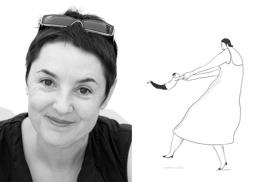
Albertina Zullo is an illustrator from Switzerland, winner of the Anderson Prize, whose works have been repeatedly awarded prestigious international awards: the Golden Apple of the Bratislava Biennale of Illustration (1999), the New York Times Book Review Prize for the Best Illustrated Book (2012), and the BolognaRagazzi Prize (2016).
In her work, Albertina focuses on the simplest, but difficult to comprehend things that are close to all people. The plots of the illustrations are simple, because the source of inspiration for them is the life itself and the personal experience of the author, sometimes they are just captured moments from life, some “travel sketches”. Her funny and touching drawings inevitably find a response in the hearts of her readers of all ages — both children and adults, although “the artist does not hide that she does not think about her young audience while working on the book. All her attention is rather focused on the creative process itself. She strives to become one with an idea, a story or a narrative”. Albertina is a real experimenter, she thoroughly studies various drawing techniques, and sometimes diametrically opposed, but in each of them she reaches the heights of mastery, and also tries to make mixes that become as popular as her famous works.
In this paper, linear compositions of Albertina, planar and compositions where the two techniques intersect are investigated. The strengths and weaknesses of each approach are revealed, the factors that led to the creation of a unique minimalist style of the illustrator are revealed. The study was conducted by collecting, studying and analyzing the works of Albertina Zullo. The analysis of data sources took place in several stages, from the general collection of material on the selected topic to the deepening of the topic: structuring and grouping of the main similarities.
LINE
The line exists in almost any composition, it is not only the extended movement of the material on the paper, which reveals the form, but also a rich means of artistic expression. The nature of the artistic language of the line is determined, first of all, by the nature of the movement and the material with which it is made. Thin, solid, intermittent, broken, soft, torn, dry, dynamic, contrasting, noisy, serious, restless, airy and many more adjectives can be attributed to various characters of the line.
Albertina Zullo is one of the experimenters in the field of linear graphics. Looking at her work, you can see the variety of characters of linear expressiveness, despite the fact that, in general, the technical palette used is quite modest. It is the balance of the minimum necessary set of graphic tools that gives Albertina’s illustrations such a special ringing penetrating feeling. How can a single line of graphite pencil convey an all-encompassing love the size of the entire universe? Surprisingly, Albertine succeeds.
Albertina has quite a lot of illustrations made only with the help of lines and one or two materials: it can be pencils, markers, ink or gouache. For each task, she is looking for a special technique that could maximize the idea of the entire publication as a whole. This search can be clearly viewed in the illustrations to the book “My Baby” and in the sketches for them — comparing the nature of the plastics of various materials, it becomes obvious that in the simplest of them, such as a simple lead pencil, those associations are hidden that can raise the work to a completely different, highest level.
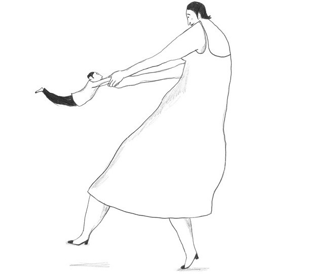
“This is a book about love, time and the cycle of our lives. And it’s also about relationships. Slowly, page by page, rare illustrations in black pencil on milky white paper tell a restrained, eloquently poetic universal story”.
The Jury of the Bologna Ragazzi Prize
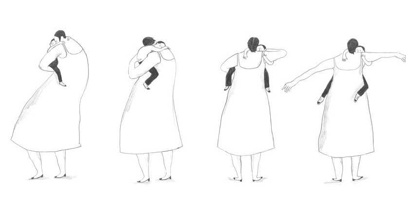
The book “My Baby” is one of Albertina’s most poignant works. The high intensity of emotions, the boundless feeling of love, can only withstand a simple pencil — it feels the warmth of hands and a lively thrill. All illustrations are made by one pulsating technique, the line is fragile, light, a little spontaneous. Monotonous smoothness of movement from page to page is very important, similar to a dance and creating continuity of the whole process.
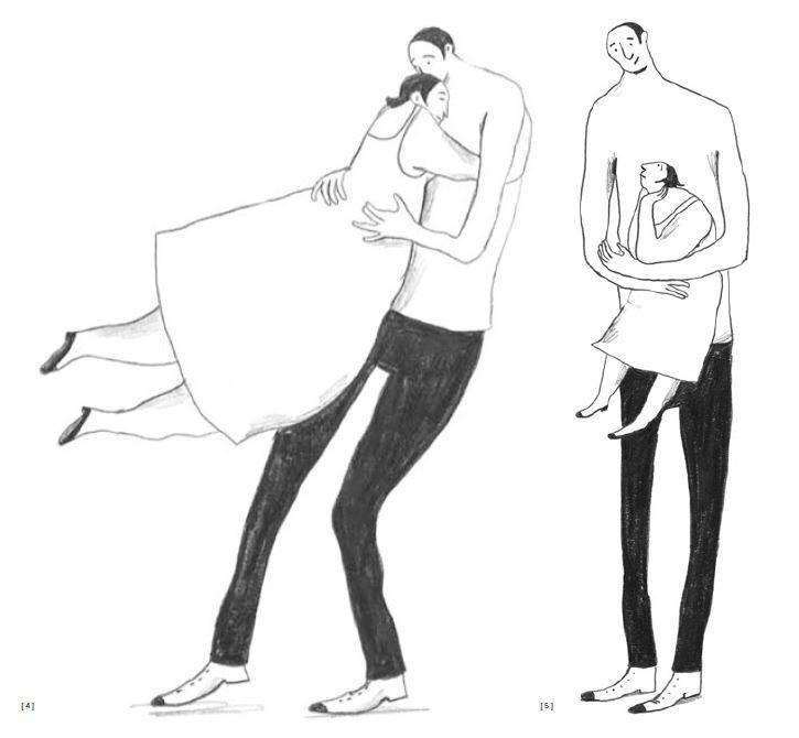
Visual means are maximally cleared of everything insignificant: there is no color, no complex textures and large spots, there is only a line, thanks to which the large body of the mother does not look bulky, but is perceived soft and warm, capable of embracing the immensity.
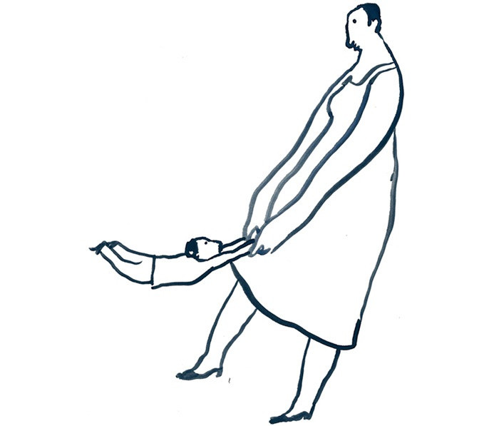
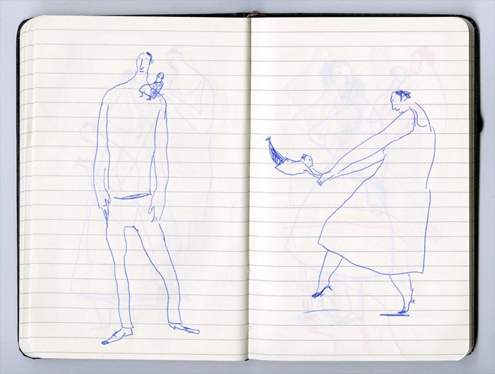
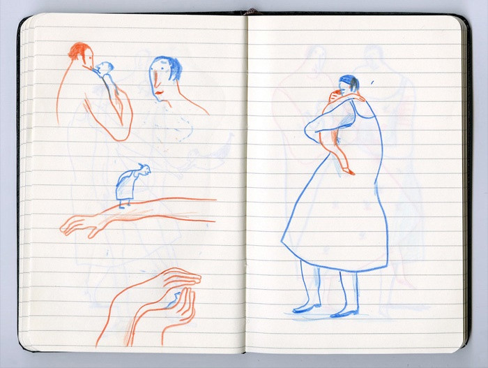
Looking at Albertina’s sketches for this book, you can compare how different linear graphic languages work to express the same idea. Some of them turn out to be quite stingy and minimalistic, do not reveal the idea as much as possible (for example, a drawing with a blue pen). Other seemingly minimalistic techniques, for example, colored pencils, look redundant, color even in a small amount pulls off part of the emotional intensity due to the fact that it itself has its own emotional charge, which does not always get in the impression that needs to be created on the pages of the book. The ink does not look so elegant, and the necessary spaciousness, lightness and airiness of the illustration are given by small feathering, which only a simple pencil allows you to do.
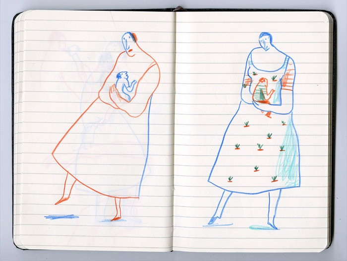
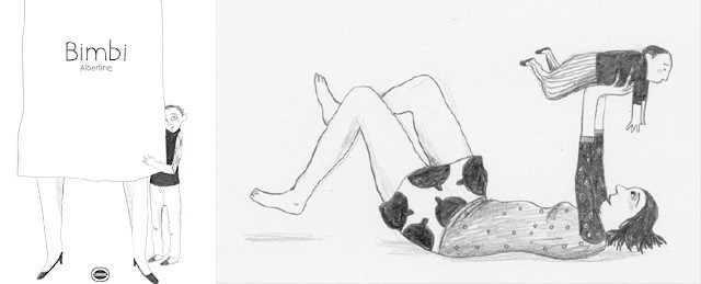
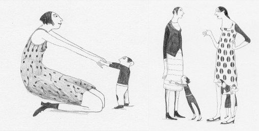
In the book “Bimbi” you can find the same spirit as in the book “My Baby”, since it is its predecessor. Here, Albertina also explores the expressive properties of a simple pencil, but in these illustrations, the purity of laconic lines intertwines with a motley pattern of fabric textures on clothes, disappears into them, bringing to the fore cute textures that create a mischievous mood. Due to a more fractional drawing, the illustrations flatten, become a little noisy and do not reach the level of the universal scale — the level to which the works from the book have reached “My baby.”
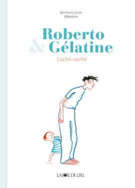
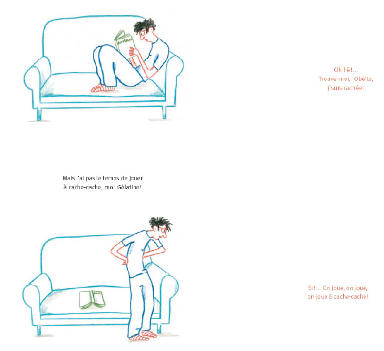
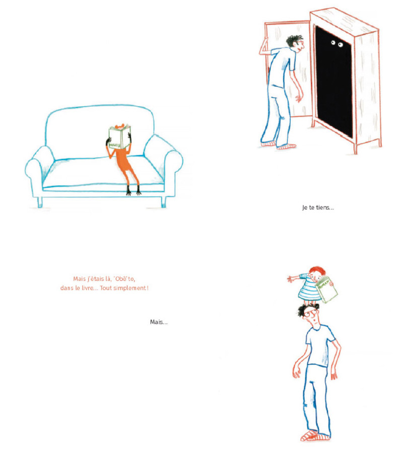
In the book “Roberto and Gelatin” illustrations are made in the technique of colored pencil. Interestingly, Albertina, in fact, uses only two contrasting colors: red and blue. Of course, there are also nuanced shades of additional colors in the illustrations, but the main contrast of warm and cold is sustained throughout history. It is this contrast that is in tune with the plot of the story and it reinforces it: the older brother Roberto is quite happy with reading a book and quietly spends time on the couch (blue), while his younger sister Gelatin wants to play and does not give rest to his brother (active red). A slight enhancement of the already minimalistic graphics in this plot works perfectly. The white air space with small patches of color amazingly recreates the atmosphere of children’s charm, lightness and spontaneity.
SPOT
A characteristic feature of Albertina Zullo’s work is an interest in experimenting in various techniques. As thoroughly as she explores the property and character of the artistic expressiveness of the line, she also thoroughly and thoroughly examines the work of large spots in the illustration.
The spot, unlike the line, fills most of the graphic plane of the composition, it has different properties compared to the line. Texture, color and fill density, color ratios working in combination with each other come to the fore. The line is secondary here, it forms by itself when joining different colors. It can be said that in comparison with Albertina’s linear illustrations, her planar illustrations are more material: the physical sensation of dense filling of bright color cannot be eliminated. Albertina always tries to keep the minimum spatiality in planar compositions, for which she chooses contrasting combinations of cold and warm tones, small shadows and light shading. The unifying feature of the diverse illustrations is a predilection for minimalism and avoidance of congestion and unnecessary details.
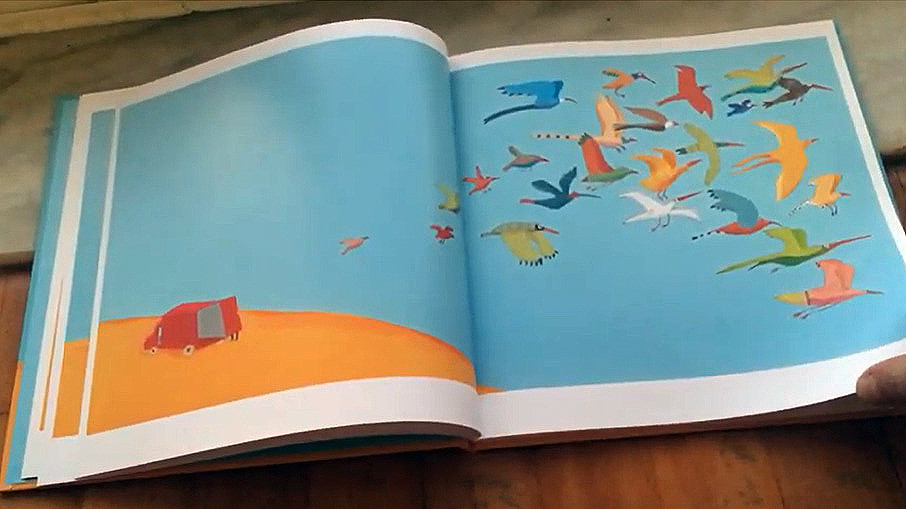
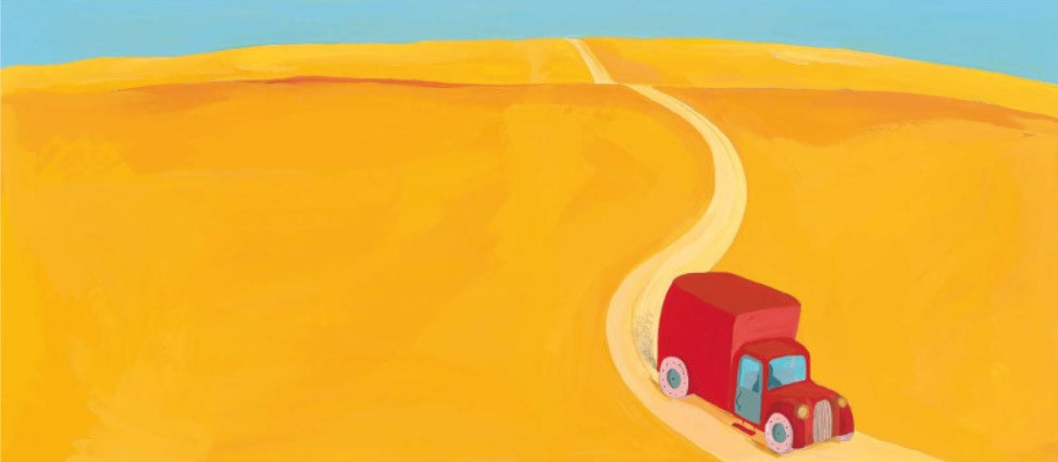
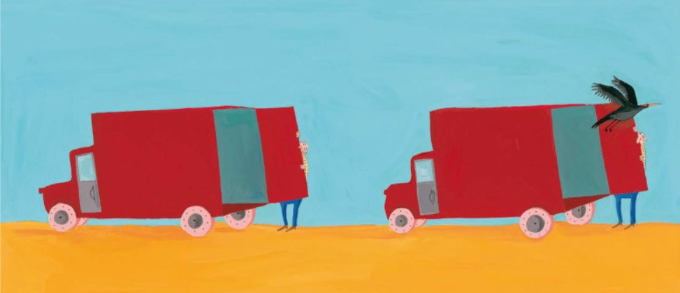
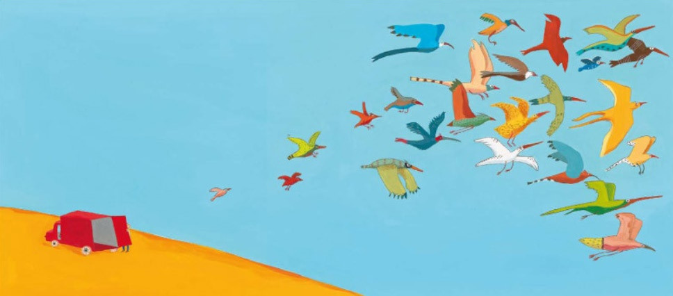
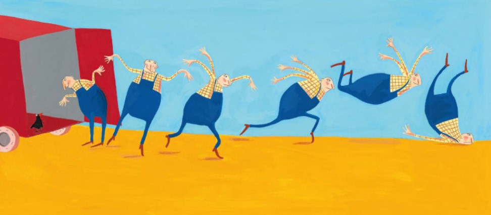
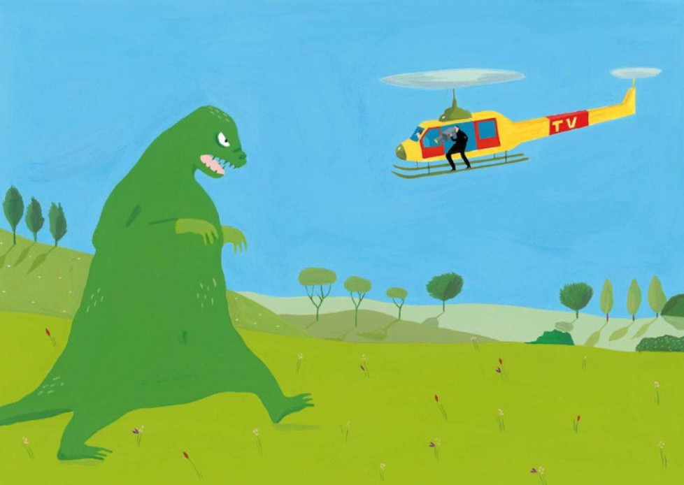
The book “Little Birds” is incredible and very touching; about the fact that one very small thing can change the big world. The illustrations are based on the contrasting ratio of the blue sky, the yellow desert and the red truck — the classic maximum contrast combination of colors in the color circle. From the large yellow fills we feel the real heat, the blue sky with warm shades that go into the green from the yellow glow supports the heat of a warm summer day. The compositions that are cleaned out of everything superfluous as much as possible give out the hand of the master, and the natural world is the world of birds that a person has let go at will, it is quite diverse — you can see various patterned textures on the plumage of birds. Despite the apparent simplicity, the illustrations are quite complex in their compositions in detail: we see different directions of movement of the lines of force within the compositions, not tearing it through, but protecting it from monotony and boredom.
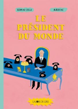
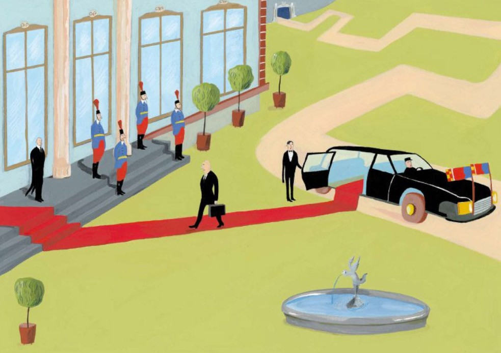
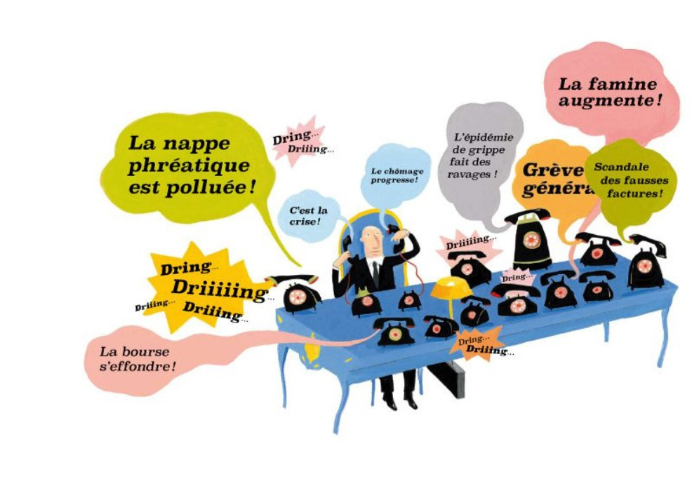
Another example of working with large spots can be seen in the book “President of the World”. Here the approach to working with color is a little different. The book is built not on contrasting colors, but on converged ones, which form a single tonal-color field, which is broken up by contrasting black color, which is present in almost every illustration in the book. Color compositions do not just exist in the form of spots of local colors, cunningly intertwined with each other. Sometimes color spots come out on a white background, getting into the territory of linear graphics, but at the same time maintaining their materiality and flatness.

SPOT AND LINE
As is typical of a real experimenter, Albertina, of course, can combine both planar and linear compositions in one work. In such cases, original illustrations appear, very characteristic, but still definitely recognizable by the features of the graphics. Albertina experiments in this mix with monochrome black-and-white images, and with color ones. It is worth noting that such a mixed technique turns out to be the most “noisy”, since in fact two techniques are used in such illustrations, that for the minimalistic nature of Albertina’s best works is a kind of verbosity, although this technique produces quite convincing and “clean” illustrations.
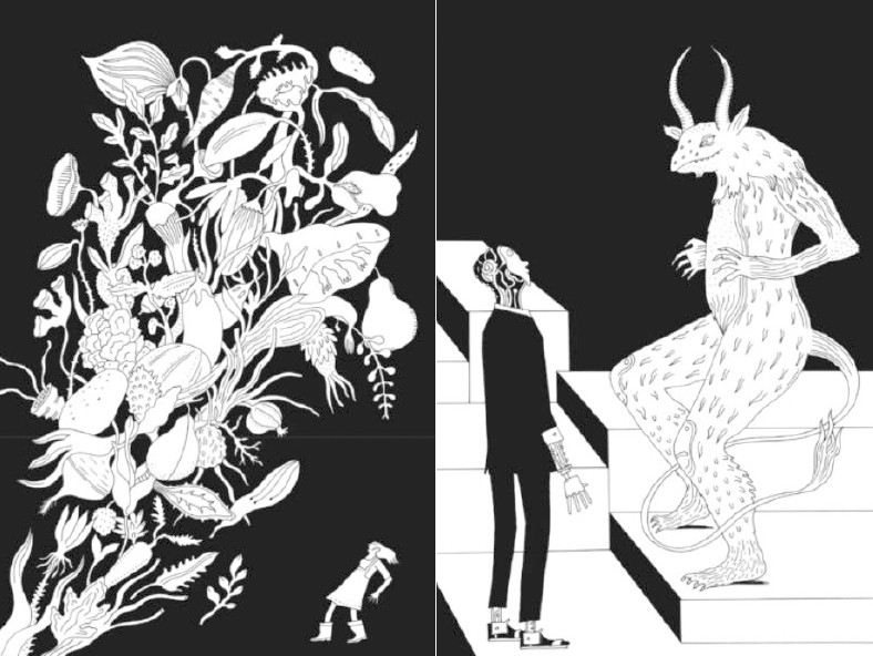
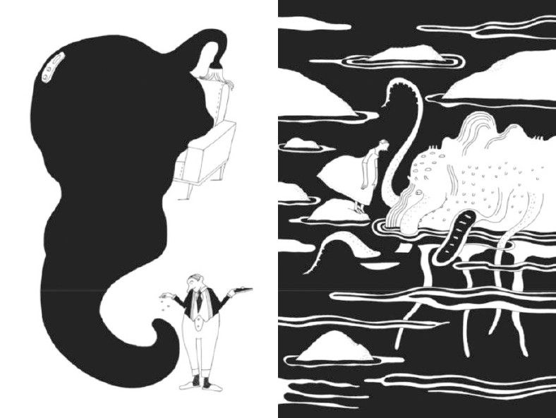
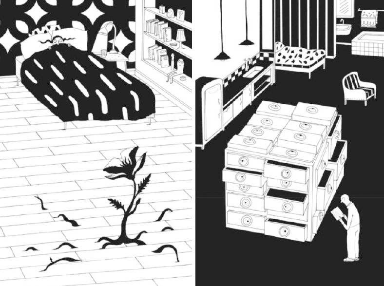
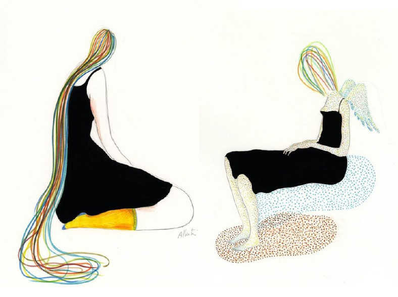
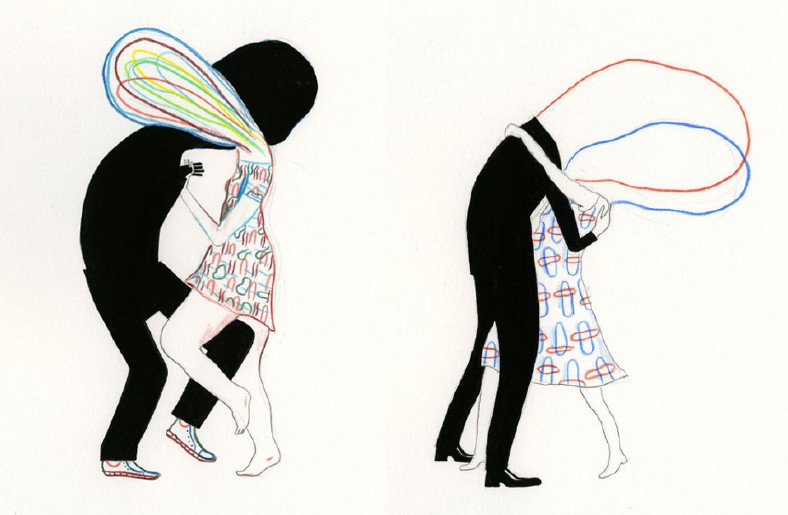
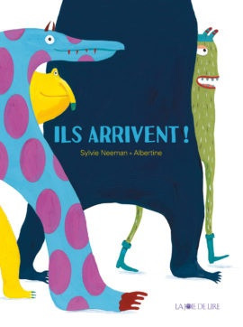
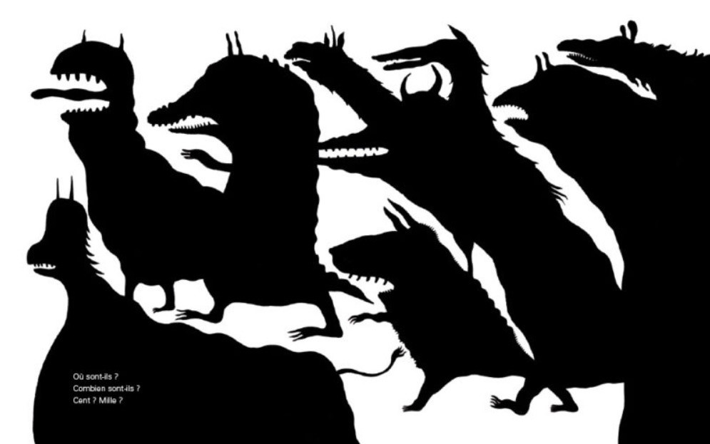
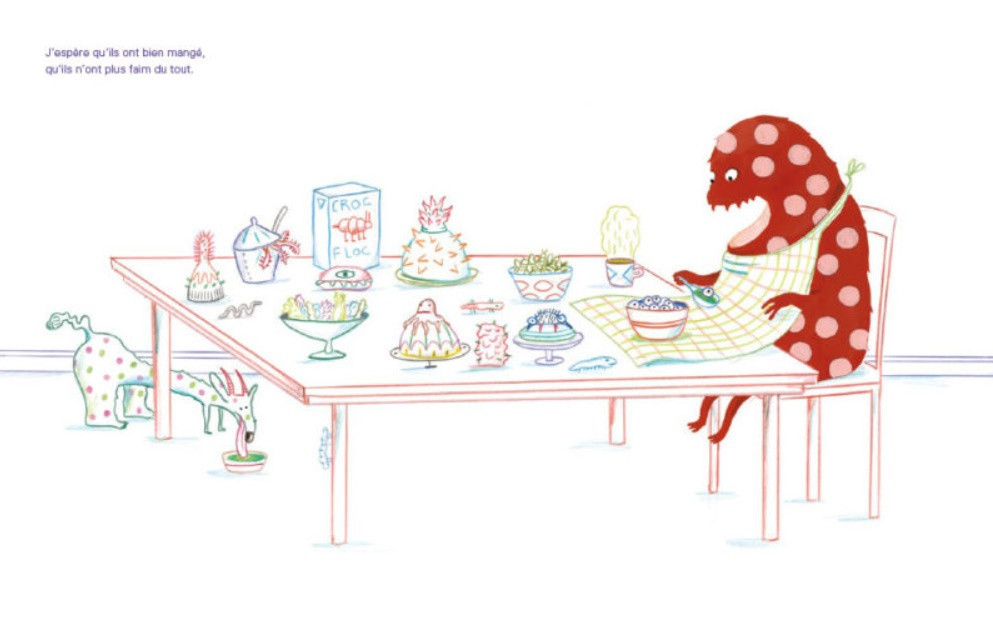
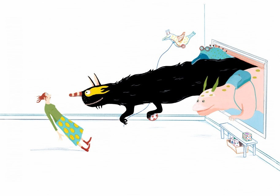
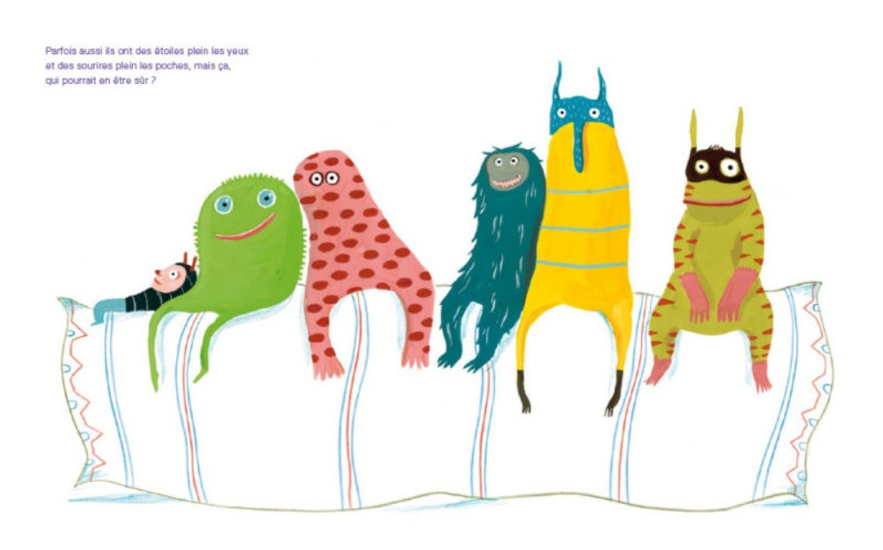
An interesting example is the illustrations for the book “They are Coming”, since there are linear and planar approaches here in full equality and perfectly complement each other: lines are woven into color spots, sometimes forming funny patterns. Spots are the main characters of the book, lines accompany and surround them, sometimes helping them to be a little more impetuous in view of their natural clumsiness or more organized. The contrast of the spot and the line in this book is played out one hundred percent and again we see that this compositional technique was not chosen by chance, it fully corresponds to the plot of the book, revealing and complementing it.
CONCLUSION
After reviewing several works by Albertina Zullo, we saw various techniques and techniques that she uses to give her works the character of maximum expressiveness. It is important to note that this is not an experiment for the sake of experiment, all “experiments” have a semantic background and most often support and develop the plot in parallel. The minimalistic style, which can be traced in many works, has become the hallmark of Albertina Zullo, and his most successful examples (the book “My Baby” and “Little Birds”) have received well-deserved awards and world-class recognition.
